COSMOS logo

Advanced Topic - Survival Analysis

Zhaoxia Yu

Load packages, read data

Code
library(tidyverse)
library(ggplot2)
library(survival) #for survival analysis

Introduction

We have learned linear regression and logistic regression:

  • linear regression: when the response variable is a numerical variable.

  • logistic regression: when the response variable is a binary variable.

Today, we will introduce methods for time-to-event data.

  • survival analysis: when the response variable is a time-to-event variable.

Motivating Example and Kaplan–Meier Curves

A Motivating Example

Researchers are comparing two new cancer treatments.

  • The outcome of interest is survival time, measured in months after treatment begins.

  • At the end of the study, they record what happened to each patient.

  • Some patients died during the study, while others were still alive when the study ended.

  • Question: Which treatment appears to help patients survive longer?

Survival Data from the Study

A: Time A: Outcome B: Time B: Outcome
5 Died 4 Died
6 Died 5 Died
8 Died 6 Died
20 alive when study ended 7 Died
20 alive when study ended 8 Died
20 alive when study ended 9 Died

Question: How to Compare the Two Treatments?

Life Table for Treatment B

All patients eventually died, so we know each patient’s survival time exactly.

Time (months) Patients Alive Survival Probability
0 6 1.00
4 5 5/6 = 0.833
5 4 4/6 = 0.667
6 3 3/6 = 0.500
7 2 2/6 = 0.333
8 1 1/6 = 0.167
9 0 0.000

Life Table for Treatment B

  • The life table summarizes how many patients are still alive over time.

  • The survival probability is simply

    \[\frac{\text{Patients Alive}}{\text{Total Patients}}.\]

  • We can visualize these probabilities using a Kaplan–Meier (KM) curve.

Kaplan–Meier Curve for Treatment B

Code
time <- c(4,5,6,7,8,9)
status <- rep(1, 6)

fit <- survfit(Surv(time, status) ~ 1)

plot(
  fit,
  xlab = "Time (months)",
  ylab = "Survival probability",
  lwd = 2,
  mark.time = FALSE,
  conf.int = FALSE,
  ylim = c(0, 1)
)
grid()
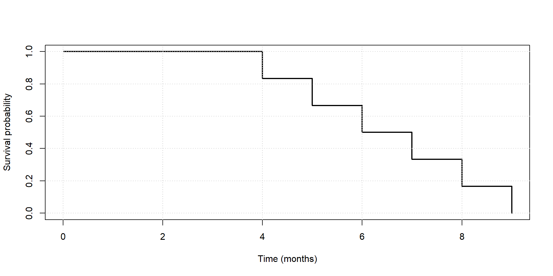
  • The KM curve visualizes survival probability over time.
    • Every death causes a vertical drop.
    • Between deaths, the survival probability stays the same.

How to Build a Life Table for Treatment A?

Time (months) Patients Alive Survival Probability
0 6 1.000
5 5 5/6 = 0.833
6 4 4/6 = 0.667
8 3 3/6 = 0.500
20+ ? ?

How to Build a Life Table for Treatment A?

  • The first three rows are easy because we know exactly when three patients died.

  • But what happens after 20 months?

  • We know the remaining three patients were still alive when the study ended, but we do not know their actual survival times.

  • Question: How should we continue the life table?

Kaplan-Meier Curve for Treatment A

Time Patients Alive Survival
0 6 1.000
5 5 0.833
6 4 0.667
8 3 0.500
20+ ? ?
Code
library(survival)

time   <- c(5, 6, 8, 20,20,20)
status <- c(1,1,1,0,0,0)

fit <- survfit(Surv(time,status)~1)

plot(
  fit,
  xlab="Time (months)",
  ylab="Survival probability",
  lwd=2,
  mark.time=TRUE,
  conf.int=FALSE,
  ylim=c(0,1)
)
grid()

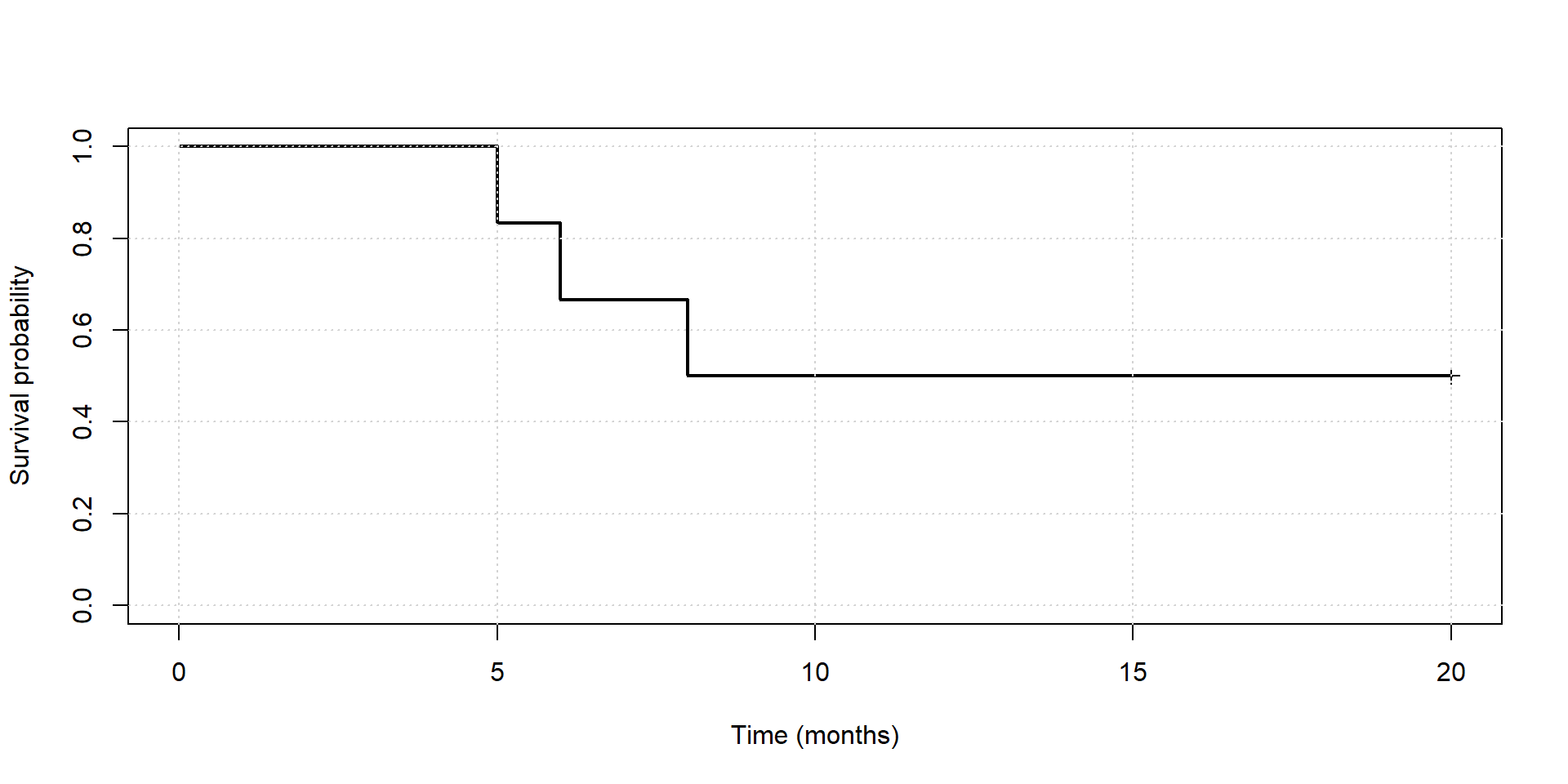
  • The curve stays flat after month 6 because

  • The small marks on the curve indicate patients who were still alive when the study ended.

Right-Censored Data

Patient Last observed time What do we know?
A 5 Died at month 5
B 8 Died at month 8
C 20 Still alive when the study ended

For Patient C,

  • we know the survival time is at least 20 months,
  • but we do not know the exact survival time.

This is called a right-censored observation.

Survival Data

Code
library(tibble)

survival_data <- tibble(
  treatment = c(rep("A", 6), rep("B", 6)),
  time = c(5, 6, 8, 20, 20, 20,
           4, 5, 6, 7, 8, 9),
  status = c(1, 1, 1, 0, 0, 0,
             1, 1, 1, 1, 1, 1)
)

survival_data
# A tibble: 12 × 3
   treatment  time status
   <chr>     <dbl>  <dbl>
 1 A             5      1
 2 A             6      1
 3 A             8      1
 4 A            20      0
 5 A            20      0
 6 A            20      0
 7 B             4      1
 8 B             5      1
 9 B             6      1
10 B             7      1
11 B             8      1
12 B             9      1
  • treatment: Treatment A or B
  • time: Survival time (months)
  • status:
    • 1 = Patient died during the study
    • 0 = Patient was still alive when the study ended

Kaplan–Meier Curves

Code
library(survival)

fit <- survfit(Surv(time, status) ~ treatment,
               data = survival_data)

plot(
  fit,
  col = c("blue", "red"),
  lwd = 2,
  xlab = "Time (months)",
  ylab = "Survival probability"
)

legend(
  "topright",
  legend = c("Treatment A", "Treatment B"),
  col = c("blue", "red"),
  lwd = 2
)
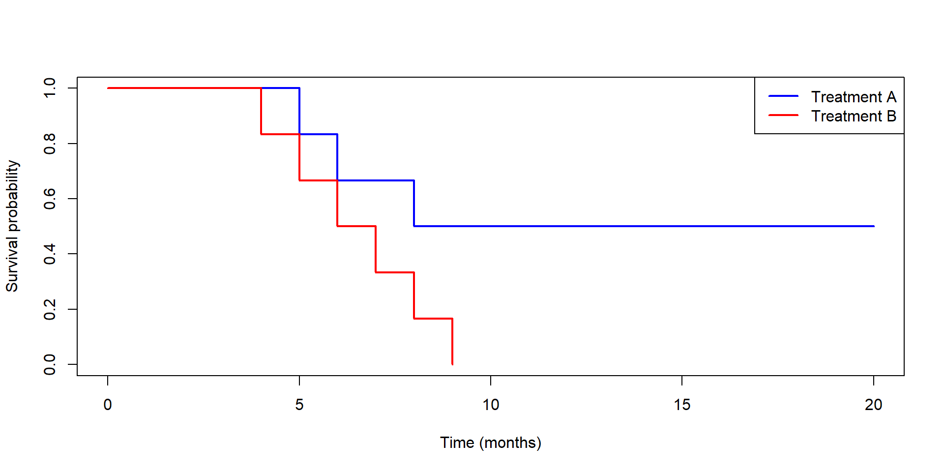
  • The two curves summarize the survival experience of the two treatments.
  • Higher curves indicate better survival.

Comparing the Two Treatments

The output in the next slide includes

  • the number of patients at risk before each event,
  • the number of events (deaths),
  • the estimated survival probability, and
  • the standard error of the estimate.

These are the same quantities we used to construct the life table.

Code
summary(fit)
Call: survfit(formula = Surv(time, status) ~ treatment, data = survival_data)

                treatment=A 
 time n.risk n.event survival std.err lower 95% CI upper 95% CI
    5      6       1    0.833   0.152        0.583            1
    6      5       1    0.667   0.192        0.379            1
    8      4       1    0.500   0.204        0.225            1

                treatment=B 
 time n.risk n.event survival std.err lower 95% CI upper 95% CI
    4      6       1    0.833   0.152       0.5827        1.000
    5      5       1    0.667   0.192       0.3786        1.000
    6      4       1    0.500   0.204       0.2246        1.000
    7      3       1    0.333   0.192       0.1075        1.000
    8      2       1    0.167   0.152       0.0278        0.997
    9      1       1    0.000     NaN           NA           NA

Are the Two Survival Curves Different?

The log-rank test compares the two Kaplan–Meier curves.

  • Null hypothesis: The two treatments have the same survival experience.
  • A chi-square test statistic is computed to test the null hypothesis. The test statistic compares:
    • the observed number of deaths in each treatment group, and
    • the expected number of deaths in each treatment group if the null hypothesis were true.

Code
survdiff(
  Surv(time, status) ~ treatment,
  data = survival_data
)
Call:
survdiff(formula = Surv(time, status) ~ treatment, data = survival_data)

            N Observed Expected (O-E)^2/E (O-E)^2/V
treatment=A 6        3     5.36      1.04       2.9
treatment=B 6        6     3.64      1.52       2.9

 Chisq= 2.9  on 1 degrees of freedom, p= 0.09 

Limitations of Kaplan–Meier Curves

Kaplan–Meier curves are useful for comparing survival between groups.

  • We often need to adjust for other important factors, such as
    • age,
    • sex,
    • disease stage, or
    • blood pressure.

Cox Proportional Hazards (PH) Regression

Example

Suppose patients receiving Treatment A are much younger than those receiving Treatment B.

  • Is better survival due to the treatment?
  • Or simply because younger patients tend to live longer?

We need a regression model that can account for multiple variables at the same time.

A Natural Extension: Cox Proportional Hazards Regression

Recall that

  • linear regression models a continuous outcome, and
  • logistic regression models a binary outcome,

Cox proportional hazards regression models time until an event occurs.

Cox PH Regression

Advantages:

  • Includes multiple predictors in one model.
  • Adjusts for confounding variables.
  • Properly handles patients who are still alive when the study ends.
  • Estimates the effect of each predictor on survival.

Example: Cox Proportional Hazards Regression

The lung dataset contains survival information for patients with advanced lung cancer.

  • time: Survival time (days)
  • status: Whether the patient died during the study
  • age: Age (years)
  • sex: 1 = Male, 2 = Female

Code
fit <- coxph(
  Surv(time, status == 2) ~ age + sex,
  data = lung
)

summary(fit)
Call:
coxph(formula = Surv(time, status == 2) ~ age + sex, data = lung)

  n= 228, number of events= 165 

         coef exp(coef)  se(coef)      z Pr(>|z|)   
age  0.017045  1.017191  0.009223  1.848  0.06459 . 
sex -0.513219  0.598566  0.167458 -3.065  0.00218 **
---
Signif. codes:  0 '***' 0.001 '**' 0.01 '*' 0.05 '.' 0.1 ' ' 1

    exp(coef) exp(-coef) lower .95 upper .95
age    1.0172     0.9831    0.9990    1.0357
sex    0.5986     1.6707    0.4311    0.8311

Concordance= 0.603  (se = 0.025 )
Likelihood ratio test= 14.12  on 2 df,   p=9e-04
Wald test            = 13.47  on 2 df,   p=0.001
Score (logrank) test = 13.72  on 2 df,   p=0.001

Interpreting the Results

Code
round(exp(coef(fit)), 2)
 age  sex 
1.02 0.60 
Predictor Hazard Ratio Interpretation
Age 1.02 Each additional year of age increases the risk of death by about 2%.
Female (vs. Male) about 0.60 Females have about 40% lower risk of death than males.

Summary

  • Linear regression estimates changes in the mean.

  • Logistic regression estimates odds ratios.

  • Cox regression estimates hazard ratios.